|
Advertisement / Annons: |
Tutorial:
|
Content:
Note: |
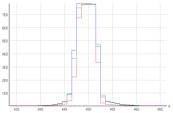
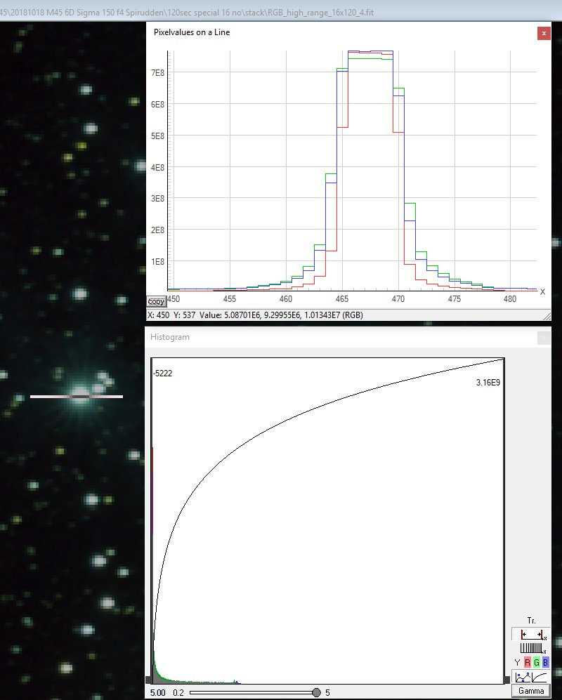
4, Line graphs and histogram:I often use the free software Fitswork when analyzing image data. Here I use it to do a line graph. In this case it's a line along the X-axis, the Y axis is the strength of the signal. The object is a strong star that is over saturated. 
Here how it looks, the top of the star has been clipped because of limits in the dynamics of the camera. 16 x 120 seconds exposure:
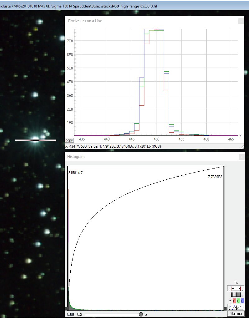
Here you can see the star that's analyzed, the vertical line that cross the star. There is also a histogram that I have set to correspond with the photo with many short exposures. At the bottom of the histogram you see how the signal only use about 1/5 of the dynamics compare to the many short exposures photo below. All the weak signals and background is the bump most to the left. 65 x 30 seconds exposure:
This photo is the one built by many short exposures, you see that the star clip at a higher level (multiply the Y and X-axis scale by 4). The star is more narrow, but even in this case the signal is clipped, but less. In the histogram you see how the signal use more of the available dynamic, signal all the way to the right on the x-axis. When stacking the photos I used the median method. That's why the scale of the axis not correspond to the difference between the photos.
I hope this give you something and not only confusing.
|
|